Primary & secondary logos for Betty Pie Co.
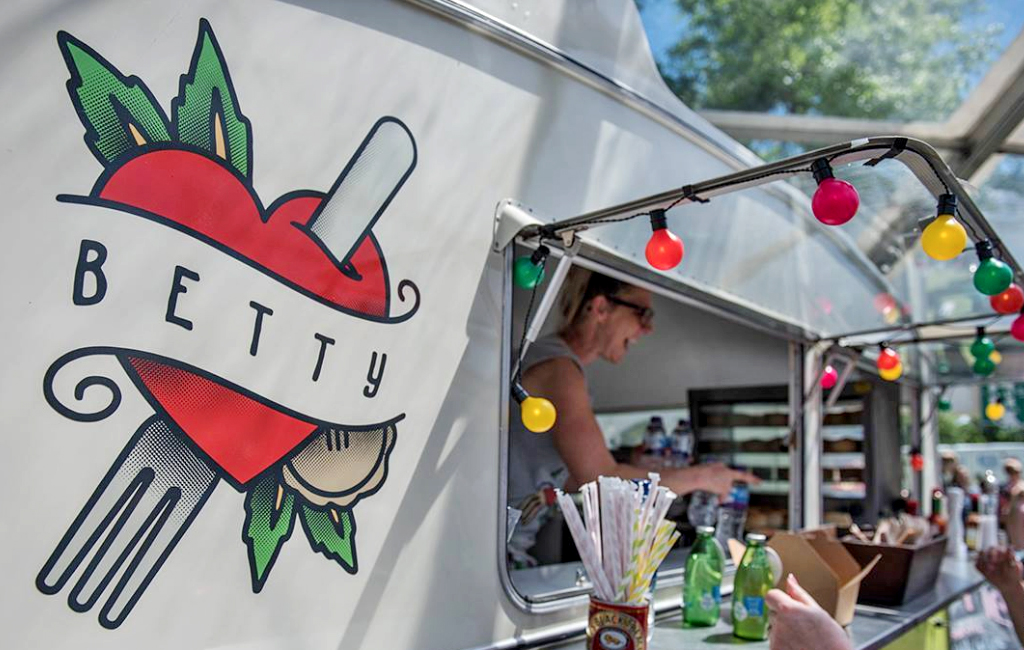
Along with the Manx Cider Company, Betty Pie Co is a family business based in Peel.
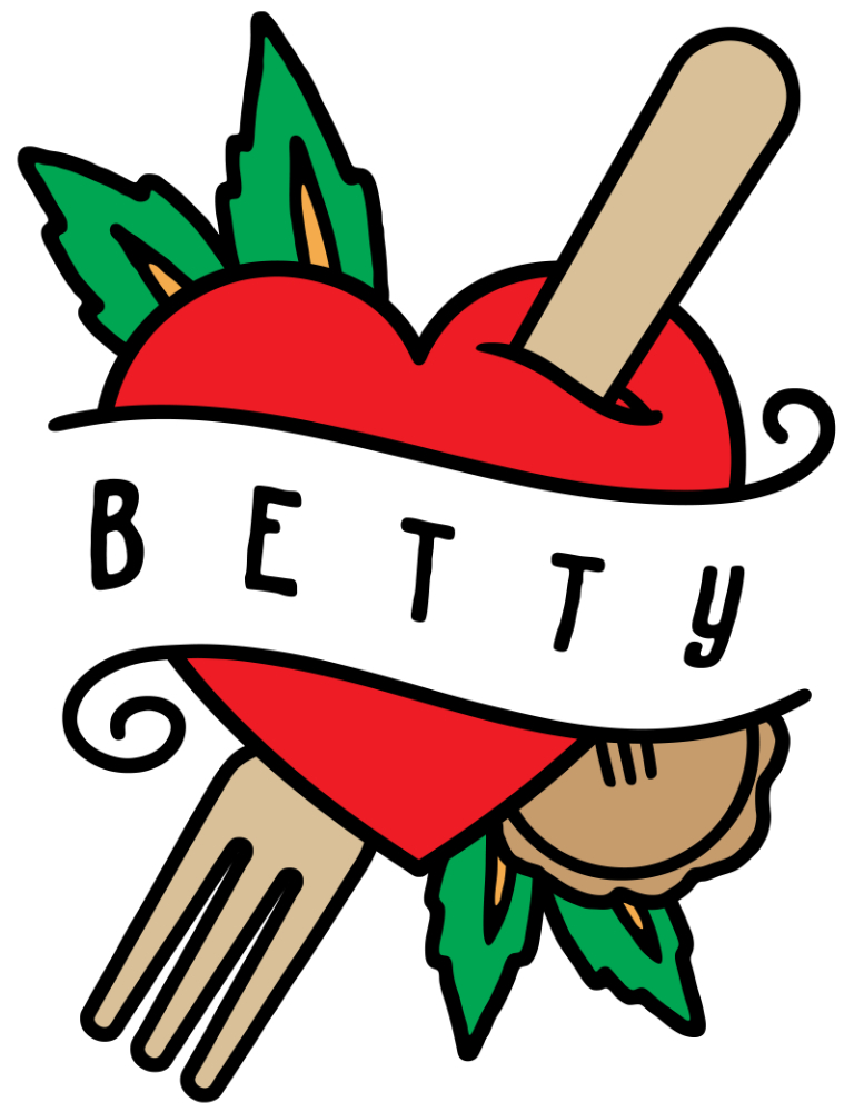
Betty was originally a modified, bright green Silverlight caravan that served freshly cooked food using local Manx ingredients. The main focus of the business is pies, but the Betty kitchen produces various food for all sorts of occasions. Owner and head pie maker Vicky, wanted a fun, retro vibe to match the caravan itself and loved the vintage stylings of traditional tattoo artwork. The logo needed to be clear and memorable and hint at what ‘Betty’ was or did.
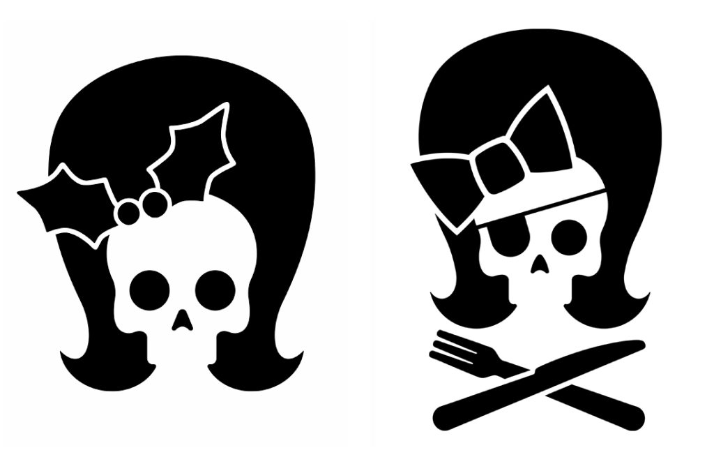
Along with the full colour heart logo a simpler one colour design was also produced that could be used on labels/tags/socials and in print. Something fun that wasn’t necessarily ‘Betty’ but could represent the brand along with the tattoo style main logo. A retro hairstyle and vintage bow helped add to the classic vibe of the main Betty heart design.
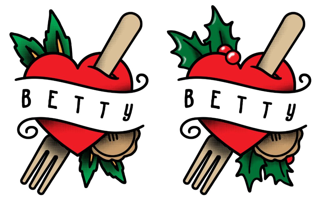
Often producing specific pies round the festive period, a Christmas version of both logos was also produced.
Photo by Mike Radcliffe Photography