
I was going to title this ‘Ads-Vantages’ but thought better of it, so… off to a strong start, eh?
I wasn’t sure the best way to go about displaying the roughs for this piece as they’re kinda scattered all over different pieces of paper that I could get my hands on when I had an idea for it. Most of them were then worked up in a lined notepad so apologies for the terrible photography and layout skills but, in all honesty, I don’t think of displaying the roughs when I’m doing them!
I probably should though as I LOVE seeing the working drawings of things – normally more than the finished piece itself so I’ll take note for future sketches.
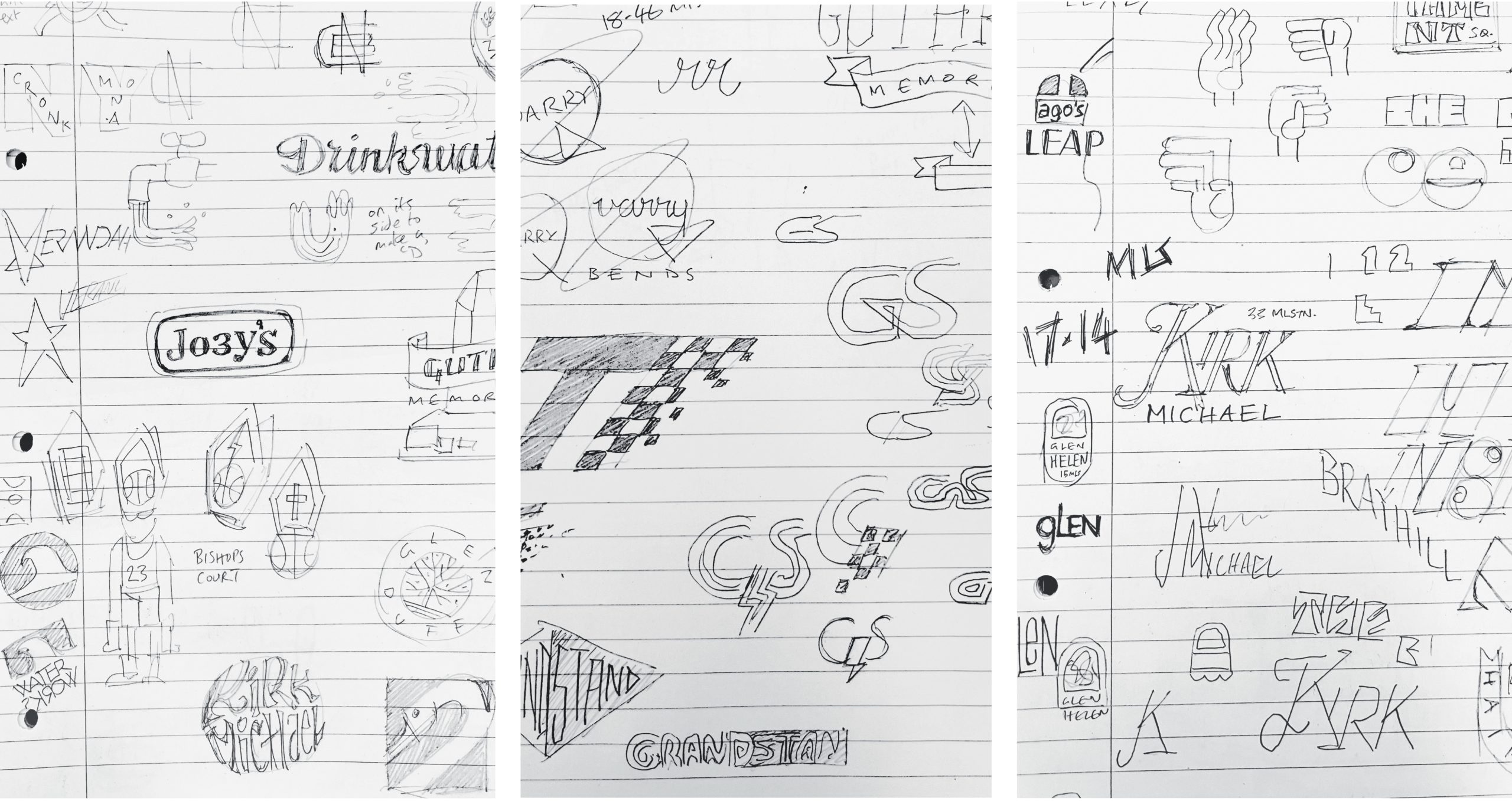
This whole piece felt like a logical progression from my Mad Sunday’s Child piece. Having drawn the various TT vantage points for years in various ways (mainly custom letters to fit on motorbikes or leathers) it kinda felt like a duh, why not just display them as individual designs?!
It probably won’t come as a surprise, but classic motorsport badges, emblems and logos were a subconscious inspiration for a lot of the designs. Although I did try to include any history, story or local link to many of the vantage point names. So I went round the houses with some designs trying to make specific imagery or styles work!
A fun fact is that I only put everything together once I’d finished designing all of the vantage points. Amazingly, (and very flukily) I only had to re-do 2 or 3 of them to make them all fit together coherently.
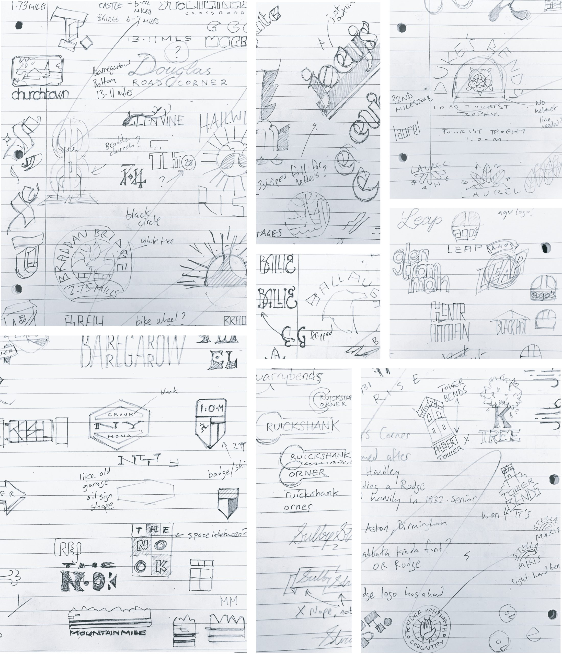
If you want to see each design drawn up clearer than these pencil sketches, head over to the ‘Work’ section of the site to see the full piece. It’s also available as a print in a light and dark version in the Shop.